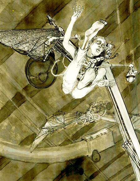
I haven’t even gotten around to drawing last week’s Illustration Friday theme, “germs” (I really wanted to do that one but I probably won’t) but I’ve got something old-ish for this week’s theme, “flying.”
Probably a better title would be falling but… I drew this image after reading Rogue Planet (a Star Wars book) by Greg Bear. Anakin is about 12 or so, getting sort of bored with the Jedi life, and seeking adventure. In one of the opening scenes he finds out about an underground race that takes place I think in the sewers of Coruscant, using these sort of winged jet-pack things. It sounded like super-enhanced hanggliding. It really just needed to be drawn.
I went for a sort of Icarus feel for the composition, and I was happy with the result, particularly the perspective. Unfortunately I rushed the background and kind of ruined it. It does have a nice raw feeling, and there is a sense of motion, but it’s just too messy to be very effective. Maybe some day I’ll cut out the surviving sections and start over.
11 Replies to “Flying”
Comments are closed.