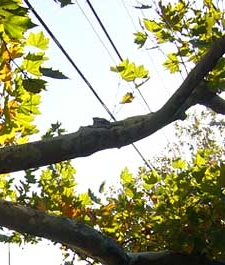
Well I guess that’s pretty obvious really. New header image, see? (*psst* look up!)
 Up until yesterday night the header image for my blog was the default image that came with the Emptiness theme. It was a nice nature image, tree branches or something, but since this is supposed to be my blog, and since I’m supposedly creative, I figured I ought to get my own image up there as soon as possible. So there it is!
If it doesn’t look awesome, that’s not my fault. I spent five hours trying to position it where I wanted it, and it still won’t look right to everyone. More specifically, if you see a white stripe cutting across the top of the tree, it means you’re viewing this site in Internet Explorer. Eventually I’ll fix that, but right now I’m designing for Mozilla because it’s a better browser, IE still has lots of quirks (including rendering my header image wrong). Eventually I’ll figure out how to fix that, but for now I’m kinda stuck. I’d suggest downloading Mozilla, not only so you can view my blog in it’s full “glory” but because it’s an easier browser to use, generally more correct, and less virus prone. If you happen to be using any other browsers than Mozilla or IE and my blog looks weird, please let me know so I can take it into consideration during design.
I want to keep the clean, open feeling of this blog theme, but I’m planning on adding a 4th column (that’s right FORTH) to the left side, for ads and other, less commercial applications. I’m hoping I can do that just by tweaking Emptiness, but I may end up having to start from scratch, which could be tricky since I don’t know PHP, am barely proficient in CSS and am still unsure of the difference between XHTML and HTML. Anyway, if you have ideas or suggestions of things you’d like to see in the design of this blog I’d appreciate the input.
You can see an underdrawing of the header image in an earlier blogpost. Eventually I’d like to replace the default avitar on the side of each blog post (the pink thing under my name) with different hand drawn avitars for different categories. Currently it’s set to display a photo for different authors, but since I’m the only author here, that’s not actually necessary. I’m not sure if that hack is possible, but I’m going to try. Ideally, the category avitars would be in a similar style to the header image, and could help to tie the whole thing together. We’ll see. I also need to figure out how to tie the blog into my overall website.
8 Replies to “New Header Image”
Comments are closed.